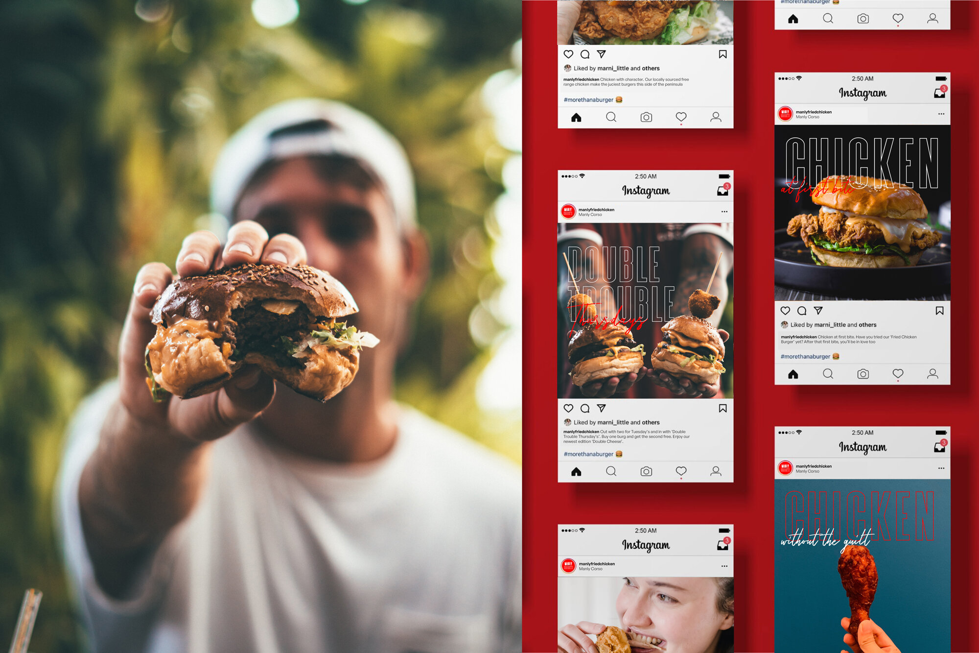
To standout in a crowded area such as Manly, you need style and substance and above all a damn good product! The team at MFC wanted a design that was youthful, bright and unmissiable in the heart of Manly. With the use of duel fonts and character illustrations I wanted to create a brand that felt more than just an average suburban chicken shop. With food at the forefront of this huge movement, the design needed to leverage people’s expectations so they would keep coming back and make it a place to visit.


![Manly_Logo [Recovered]-06.jpg](https://images.squarespace-cdn.com/content/v1/604c02d865efd23c69d3c208/1621766131539-ZQ64SGZU2XRSNEKBCXJZ/Manly_Logo+%5BRecovered%5D-06.jpg)
![Manly_Logo [Recovered]-03.jpg](https://images.squarespace-cdn.com/content/v1/604c02d865efd23c69d3c208/1621766242925-8WK7Z32X6MZR23IK7ZWS/Manly_Logo+%5BRecovered%5D-03.jpg)
![Manly_Logo [Recovered]-04.jpg](https://images.squarespace-cdn.com/content/v1/604c02d865efd23c69d3c208/1621766306237-EIWNSU3QKOSN94LYG8WM/Manly_Logo+%5BRecovered%5D-04.jpg)